

Colour planning for headwear is often reduced to trend boards and brand palettes. That is incomplete. The same colour can behave differently across climates, channels, materials and use cases: white may support a hot-weather corporate range but expose sweat and handling marks; black may simplify merchandising but absorb heat and show fading; fluorescent yellow may improve conspicuity in one work environment while being inappropriate as a fashion claim.
A regional colour plan should therefore connect market role, physical material, customer use and repeat-order control. This guide explains how buyers can build neutral core palettes, seasonal colour extensions and high-visibility programmes without confusing style preference with performance evidence.
Separate Colour Roles Before Selecting Shades
Every colour in a range should have a job. A core neutral protects repeat business, a seasonal colour creates newness, a brand colour supports identity and a functional colour may respond to visibility or environment. Problems begin when one shade is expected to do all four.
Core Neutrals
Black, navy, grey, stone and white usually carry the broadest channel compatibility. They are easy to combine with uniforms and apparel, reduce perceived fashion risk for wholesale buyers and can remain active across seasons.
Neutral does not mean operationally simple. Black can expose abrasion and wash fading. White reveals backing, seam allowance, sweat salt and warehouse handling. Navy varies widely between dye lots. Grey can shift warm or cool enough to conflict with an existing uniform.
Brand Colours
A brand colour must be translated from a digital identity into fabric, thread, ink and trim. Those materials reflect light differently, so one screen value cannot guarantee a visual match across the whole cap.
The corporate headwear procurement guide explains why physical fabric and thread references, logo dimensions and placement should be approved together rather than through screen mock-ups alone.
Seasonal and Regional Colours
Seasonal colours should extend the range without fragmenting demand. Use them on proven silhouettes, limit the number of new material-and-colour combinations and define which shades can be reordered versus retired.
The year-round assortment guide shows how core, seasonal and limited products serve different commercial roles.
Build Regional Palettes From Use and Channel
A regional palette should begin with where and how the cap is sold, not assumptions about national taste. Corporate, outdoor, fashion, school and gifting channels can require different colours in the same country.
Gulf Markets
Light neutrals can support hot-climate, golf, hospitality and premium gifting programmes, but they show dirt, sweat and backing more clearly. Dark shades can remain important for formal brand systems even when they are not the coolest wearing option.
The Gulf market headwear guide connects colour with technical fabric, ventilation, Ramadan planning and corporate distribution rather than treating beige and white as a universal regional formula.
Australia and New Zealand
Outdoor and institutional programmes may prioritise coverage, visibility and easy identification, while fashion and tourism ranges can use washed or natural palettes. Colour does not replace brim coverage or a verified protection claim.
The Australia and New Zealand guide explains the difference between broad-coverage hats, performance caps and lifestyle products under high-UV conditions.
North America
North American channels support both conservative commercial colours and high-contrast sports or streetwear palettes. A retailer may need clear good-better-best colour architecture, while a team or promotional buyer may prioritise exact brand matching.
The North America market guide covers assortment, fit, labelling, origin marking, tariff planning and retail release records.
Do Not Confuse Bright Colour With High Visibility
A bright orange or yellow cap can be visually noticeable without being certified high-visibility personal protective equipment. Functional visibility depends on the actual task, background, lighting, material performance and the applicable product or workplace rules.
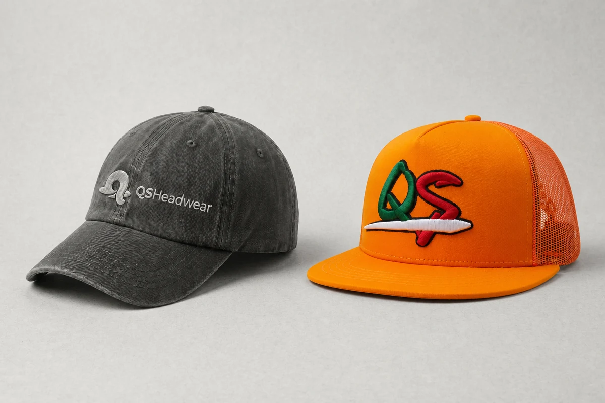
The UK Health and Safety Executive states that effective high-visibility clothing should use a colour that allows the wearer to stand out against the ambient background. Its high-visibility clothing guidance also notes that darker conditions or worksites require more high-visibility clothing and that retroreflective material may be needed for headlights or darkness.
Background Determines Contrast
A colour that stands out against dark machinery may disappear against sand, foliage, bright concrete or another high-visibility uniform. Review the real environment and adjacent clothing rather than selecting a fluorescent shade from a catalogue.
A Cap Is Usually a Supplement
Headwear contributes visibility at head height, but its small area should not be presented as a substitute for compliant high-visibility garments. Our high-visibility workwear cap guide explains how fluorescent fabric and reflective details can supplement a programme without overstating a class rating.
Keep Retail Colour Separate From Safety Claims
A fluorescent fashion cap can be sold as a colour choice when the copy avoids unsupported safety claims. Once the product is promoted as protective equipment or as meeting a standard, the evidence and market rules change.
Specify Colour as a Physical Standard
Colour names such as khaki, stone, royal blue and navy are not specifications. Use an agreed physical reference and define how the match will be assessed.
Control the Material, Not Only the Colour Code
The same target shade can appear different on cotton twill, recycled polyester, corduroy, wool blend, mesh and embroidery thread. Surface texture, sheen, pile, wash and backing change perception.
The cap fabric guide compares these material behaviours and shows why colour approval must happen on the intended substrate.
Use Instrumental Data Where the Programme Needs It
ISO 105-J03:2009, confirmed as current after review in 2025, provides a method for calculating colour difference between two specimens of the same material measured under the same conditions. It allows a numerical tolerance to be specified according to the closeness of match required for the end use.
The standard does not choose an acceptable tolerance for every cap. The buyer and supplier must agree the material, instrument conditions, reference, tolerance and visual review method appropriate to the programme.
Combine Instrument and Visual Review
Instrument readings reduce subjective argument, but the customer sees the assembled product. Review fabric, thread, mesh, trim and printed components together under controlled lighting, then record the approved result.
Manage Dye Lots and Repeat Orders
A colour approved once does not remain controlled automatically. New fabric lots, thread lots, wash recipes and subcontractors can move the result while the colour name remains unchanged.
Keep Sealed Standards
Retain a protected fabric swatch, thread reference and complete approved cap. Record supplier, material code, lot, date, lighting and revision. Store the sample away from light, dust, moisture and compression.
The golden sample library guide explains how master and working samples remain controlled across seasons and suppliers.
Set Reorder Approval Gates
For repeat orders, confirm whether the material lot is unchanged. If not, review the new lot against the physical and numerical standard before decoration and bulk cutting.
Do not wait for final inspection to discover a shade shift across thousands of units. Colour approval belongs before production release.
Control Washed and Distressed Products Differently
Garment washing creates an intended range rather than one perfectly uniform shade. Define the approved light, target and dark boundaries, then calibrate the production lot against those examples.
A single average reading cannot describe every acceptable washed appearance. Record the visual boundaries and the wash process alongside the specification.
Use Colour to Build a Commercial Range
A colour plan should protect margin and inventory, not only fill a presentation page. Too many colourways dilute volume, increase setup and material minimums, and make reorders less predictable.
Choose a Core-to-Seasonal Ratio
Give most volume to proven neutrals and brand colours. Use smaller controlled quantities for seasonal or regional tests. Review sell-through, returns, markdown and reorder requests by colour rather than only by style.
Apply One Colour Across Several Silhouettes Carefully
A navy cap, mesh trucker, visor and beanie will not look identical because the substrates differ. Decide whether the range needs an exact technical match or a coordinated family appearance.
The streetwear headwear guide explains how distinctive colour and decoration create recognisability, while controlled scarcity and quality protect perceived value.
Use High-Contrast Colours for Operational Roles
Event staff, guides, teams and supervisors may need to be identified quickly without making a formal PPE claim. Use colour contrast deliberately and state the operational purpose in the brief.
Build Colour Into the Supplier Brief
The brief should include the physical reference, target material, colour code where used, approved thread and trim references, lighting conditions, instrumental method if required, visual tolerance and approval owner.
Ask the Supplier to Expose Assumptions
Confirm whether fabric is stock-dyed, custom-dyed, garment-washed or printed, and whether mesh and sweatbands come from separate suppliers. Ask which components cannot be matched exactly and review the proposal before quotation approval.
Qualify the Final Decorated Sample
Embroidery density, backing, heat transfer and patches can change how the surrounding colour appears. Approve the finished decorated cap rather than a blank fabric swatch alone.
Connect Colour to Performance
For active products, test colour together with UV exposure, sweat, washing and abrasion. The performance cap guide covers how technical fabric and repeated use affect the product beyond initial appearance.
Frequently Asked Questions
Which neutral colours are safest for a global cap range?
Black, navy, grey, stone and white are broadly usable, but none is risk-free. Review heat, fading, staining, backing visibility, brand coordination and local channel expectations.
Does fluorescent colour make a cap high visibility PPE?
No. Visibility depends on environment, lighting, material performance and applicable requirements. A cap is normally a supplement to the wider protective programme.
How should colour tolerance be specified?
Use an agreed physical reference, the final material, controlled measurement conditions and a numerical and visual tolerance appropriate to the end use.
Why does the same colour look different on mesh and cotton?
Fibre, weave, sheen, texture, openness and backing change how light is reflected and transmitted. Coordinated appearance may be more realistic than exact visual identity across substrates.
How should washed colours be controlled?
Approve a target and acceptable light/dark boundaries, record the wash process and compare production against the full range rather than one average sample.